Role: Design Lead
Client: Capital One Card Site
Opportunity
Optimize the mobile credit card homepage so customers can quickly and efficiently navigate through the page on a mobile device and feel just as confident as they would if they were on a desktop device.
Outcome
A mobile-first design that prioritized usability and a clutter-free shopping experience.
Metrics
The new layout drove a 1.4% conversion lift, resulting in an incremental $4.7M annual profit.

Optimized homepage design
The mainstreet customers needed a better mobile experience
There are two general buckets of customers that enter Capital One's card site pages: Upmarket customers, who have a higher FICO score, higher income, and are generally able to be approved for most any card they choose, and mainstreet customers, who have lower FICO scores, could be on their first credit card, or are on their journey of building credit. The latter are at a higher risk of being declined. The card site team and I just finished an in-market test of a segmented credit card homepage experience. This new experience shows a slightly different homepage depending on which customer bucket a site visitor falls into.
Our hypothesis was that by showing a more relevant set of products and customer values, we would see a significant lift in conversions. That hypothesis was proven correct, but only for customers visiting from a desktop device. Mobile customers showed no statistically significant change.
Data driven problem solving
Working closely with a data analyst, I was able to see areas of low engagement. Through that, alongside looking at the homepage with a mobile-first lens I was able to identify opportunities to improve the experience.
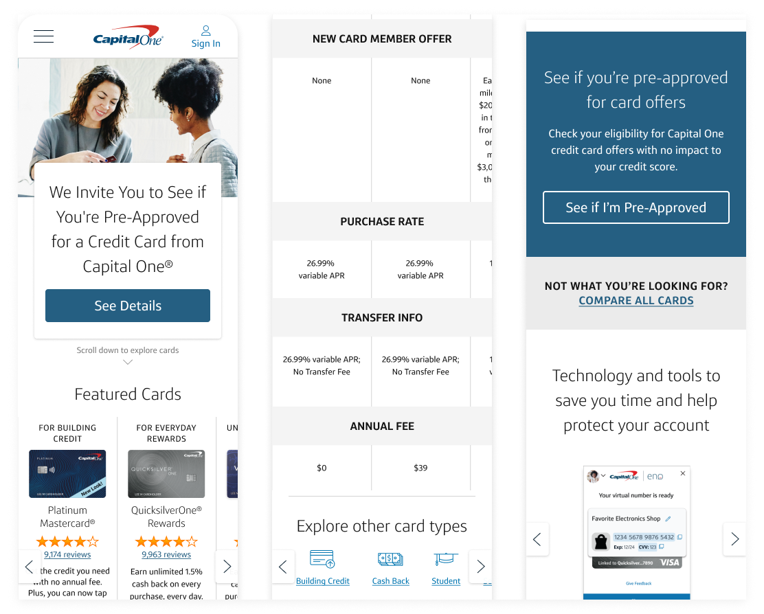
I saw a lower engagement for the scrollable secondary nav, due to no clear affordances customers were not scrolling horizontally or interacting with the icons. The three-column featured cards component squished the text too much and wasn't visible above the fold. The page had too much information, leading to an extremely long scrolling page. Finally, the overall hierarchy of the page didn't reflect the mindset of customers, mixing low funnel and high funnel pathways, instead of a more intuitive progression.
These types of mobile-specific components were not accounted for in our design system. Keeping the basic design system structure, I created mobile-specific components that were much easier and clearer to use.
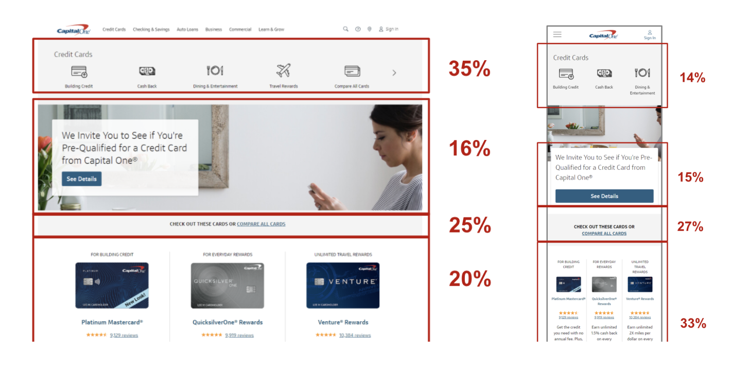
Click rate of non-mobile optimized homepage
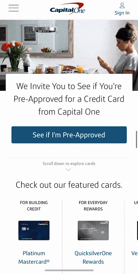
Mobile first solution that increased conversions
The optimized mobile homepage flowed very smoothly on a mobile device. This was done by reordering the hierarchy of the page while condensing and optimizing components to be more mobile friendly. Most notably, I designed a three-column horizontal scrolling featured card component that gave the text room to breathe with a clear affordance that the section was meant to scroll. While reducing this section to just two products would have manifested in an even cleaner experience, after considering business needs, removing a product was a non-negotiable.
The team launched the optimized designs as an in-market test and saw significant positive results for the mobile-optimized homepage, resulting in a $4.7M annual increase.