Role: Design and Motion Lead
Client: Capital One Card Site
Opportunity
Refresh the Credit Card Compare page that has been largely untouched since 2013 to support current needs of a growing product list.
Outcome
A simple, straightforward filter, optimized for mobile, and contextual nudges towards pre-approval
Metrics
500% increase in mobile engagement and a 15% conversion lift, equaling $4.8M gained annually

Compare page resdesign
Redesigning an untouched relic
Nearly eight years had passed since the Credit Card Compare page design had been refreshed. This page acts as a catch-all for customers who want to explore as well as those who need to get straight to the point. As it’s one of the most highly trafficked pages on the credit card site, it presented a huge opportunity to improve on the existing design.
The majority of our card site customers fall within the mainstreet bucket. Mainstreet customers are those with lower FICO scores due to never having credit or being at the start of their credit-building journey. We know they typically browse and shop on mobile devices (about 75% do) and appreciate guidance through their shopping journey. Understanding this led us to focus heavily on the mobile experience first.
Historical research and user testing showed choice and speed is key
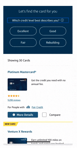
Digging through past internal research, industry trends, and UX best practices revealed three key hypotheses to test. First, condensed and minimal card details that are pre-grouped in logical categories will allow customers to get a better overview of our cards more quickly. Second, streamlining the filter to just two questions and presenting those progressively will allow customers to find the card they are looking for in just two taps. Lastly, giving robust filtering options and shrinking the UI while keeping it sticky to the top of the device will give the customer more choice in how the filter can work for them.
After a round of unmoderated user testing with 20 participants (split between upmarket and mainstreet customers), I had a few clear next steps. I learned that our customers like guidance and want their filter options to be obvious. Choice is key; customers want to be able to just dive into all the cards or dive into the filter. Being able to freely move between these two is most helpful. Lastly, speed is a must. The filter must deliver results instantaneously.
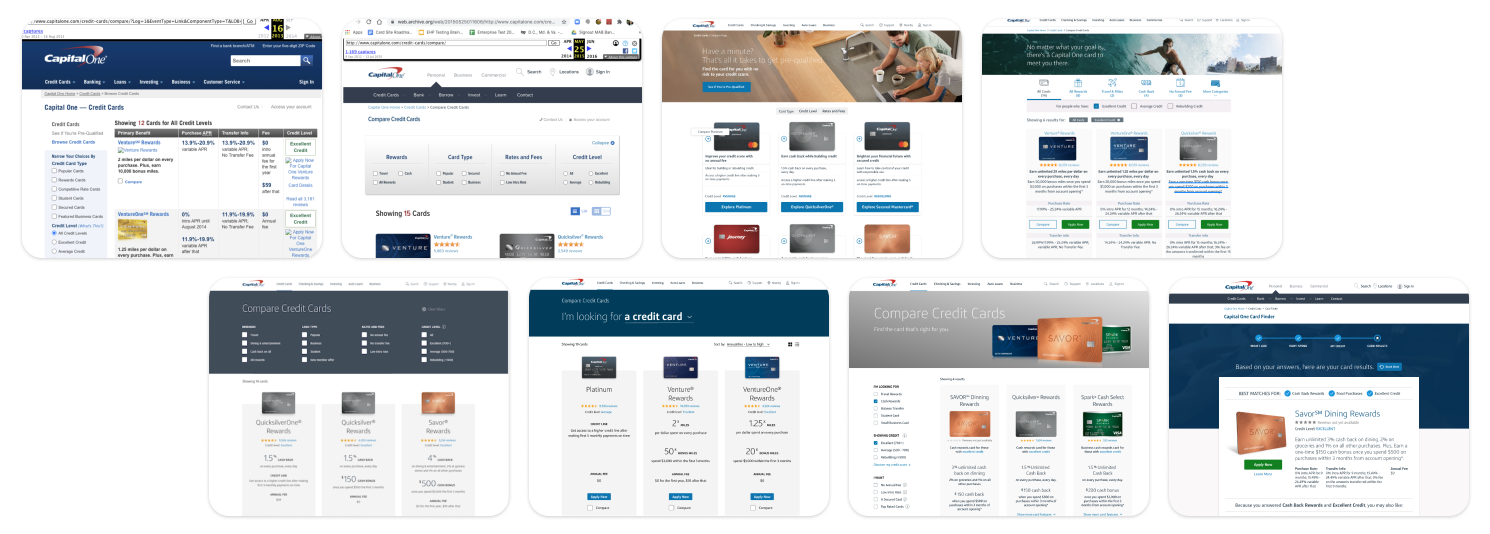
Previous Credit Card Compare Page designs, most never made it to production
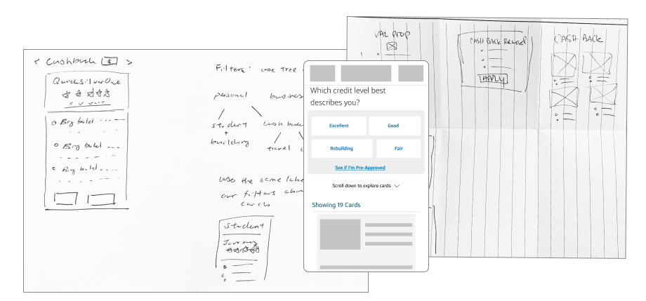
Sketches from design jam
Turning research insights into solutions
From these takeaways, I went through refining the strongest, most feasible concept for a short-term goal with a plan to integrate parts of the other concepts in the long term. I dove into refining the filter and expanding on what other low-level effort opportunities could accompany it. In the end, this new filter with contextual pre-approval CTAs and a bottom sheet modal was a strong winner.
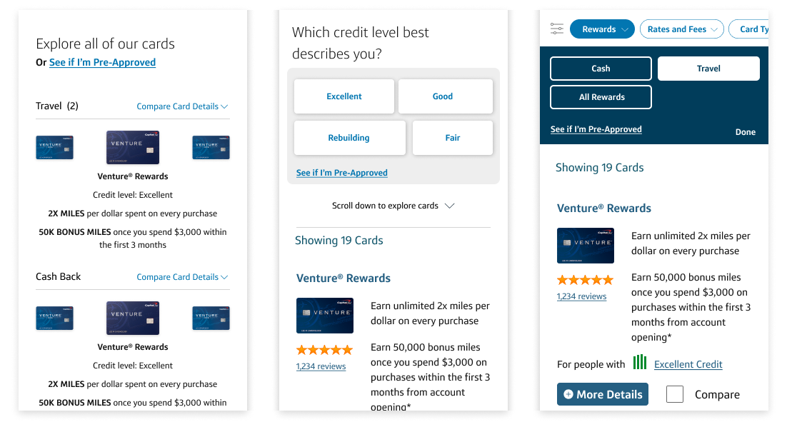
Three designs for three hypotheses
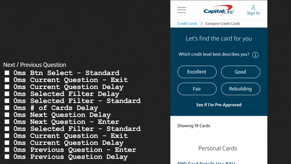
Speed and feedback loops through motion
To ensure the filter interactions felt fast but not abrupt, I crafted simple transitions between filter questions to lead the customer's eyes and give feedback at each step. Working closely with a developer, I was able to build the transition to be nearly identical to the motion spec.
The design was split into multiple tests to ensure there was a clear understanding of each variable and how they all performed. Each test has proven to have positive lifts in engagement and conversions on the page, and the team is working on the last test before the full concept is complete. The most recent test results showed a 500% lift in mobile engagement with a $4.8M annual increase.